By the numbers
- 175semantic tokens per mode, light and dark, on top of 232 primitives
- 34components in the registry, each with a page in the /ds showcase
- 0hard WCAG 2.2 AA contrast failures, both modes, measured 16 Oct 2026
- 58.5%showcase completeness in my own 14 Oct audit, with a floor that can only go up
Counts are from the repo docs and scripts, not from users. Nothing here measures adoption or outcomes, because there are no launch metrics yet.
Discover
Overview
One system for a site that is plain, unhurried and specific, drawn in Figma and enforced in code.
bendybethc.com is a patient-authored health site, and the design system's own README sets the register: the writing does not perform cheerfulness, and neither should the interface.
The system has three layers. Primitives are raw values. Semantic tokens (surface, text, border, icon) alias the primitives, and components are only allowed to use the semantic ones. Dark mode is one attribute on the page, data-theme, that re-points the semantic tokens, so no component carries dark-mode CSS.
It lives in the website repo at ds-bundle and components/ds, and it ships as a /ds showcase: every component with its props, states, do and don't, and the tokens it reads. The repo has 952 commits on main since 28 Dec 2025, and that count covers the website too, not only the system.
I design in Figma and the code follows. Claude writes much of the code with me, so the part that is mine is the rules and the Figma file, and the scripts below check the rest.
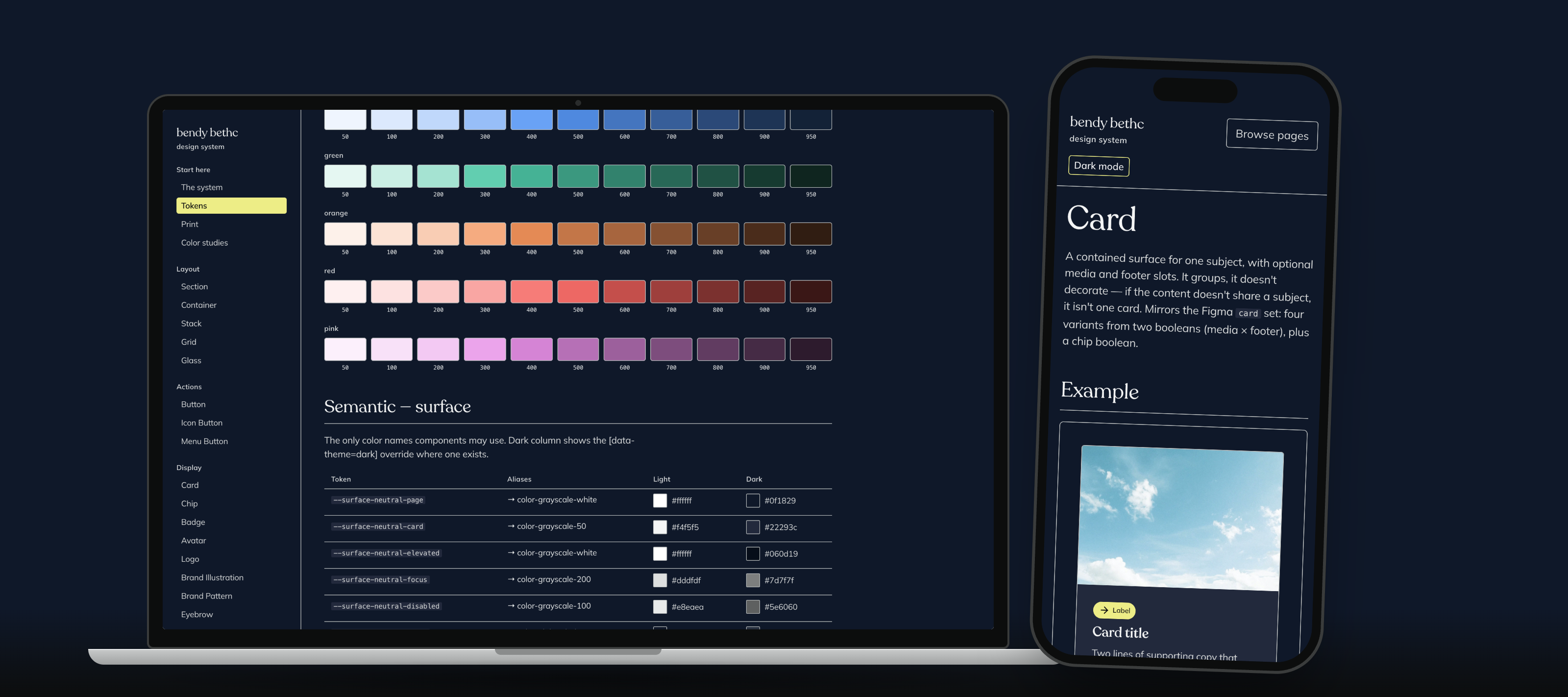
Text version of the video
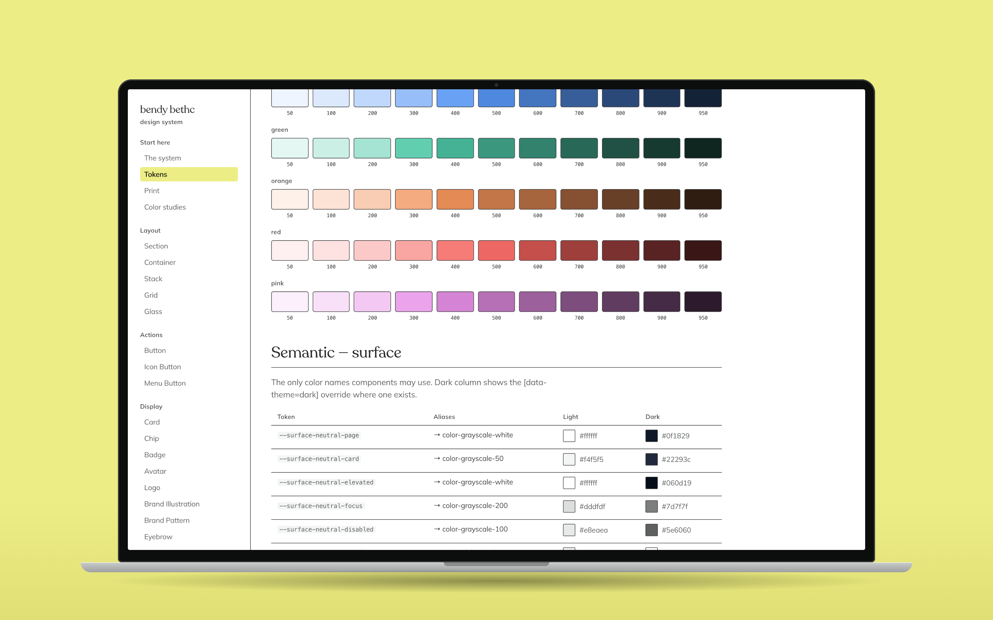
- The Foundations page opens with the laws and the colour primitives.
- A scroll down to the semantic surface table, light and dark values side by side.
- Click Dark mode: the whole page re-points to navy with no layout change.
- Open Button, read the props, then switch back to Light mode.
- Open Playground: every variant of button, chip, badge, alert and input in one grid.
Define
Problem
The system existed, and the site still wasn't using it.
On 4 Sep 2026 I sent a screenshot of the site and said: "if this is how my design system looks when used we have a lot of work to do." The tokens existed, and the pages weren't reading from them.
On 8 Sep the CSS audit measured it: 49% of the site's page-CSS declarations used a token, the rest were raw values.
The failure underneath was quiet. A hand-patched colour survives until the next pull from Figma, then silently reverts, so the fix looks done, ships, and undoes itself.
That is the problem I built the rest around: not how to make a token, but how to make drift loud enough that it cannot reach a page unseen.
Define
Persona
Maya is a composite: 34, on her phone late at night, after a TikTok comment thread.
The design system's README is written for one person: Maya, 34, suspected hEDS, four years deep in the medical maze, arriving on her phone late at night from a TikTok comment thread. I did not interview her, and she is not a quote I can source.
The sourced voice here is mine. The README states the mission in my words: "I build the tools we need for people like us, so you don't have to suffer as much or as long as I did." I am a patient too, and the site is for people with hEDS, MCAS, POTS and late-diagnosed autism.
What that asks of an interface is concrete. Calm over cheerful. Readable on a phone late at night, so every semantic token has a dark value. Plain type, two faces only, Behind The Nineties for headings and Inter Tight for everything else.
I'd rather say plainly that no patient has tested this than invent a quote that sounds like one.
Discover
Research
Three audits of my own work, one measurement script, and no user testing.
Before and during the build I audited it three times. A UX and design-system audit of the site on 22 Jul 2026. A CSS audit on 8 Sep that measured how much of the site was actually on the system. And a design-system and showcase audit on 14 Oct that scored all 34 components across 14 columns and came out at 557 of 952, 58.5%.
Before I changed any colour on 4 Sep, my first instruction was to audit the existing tokens in Figma, then fix them at the system root.
What I did not do: user research. No patient or clinician testing is recorded, and neither is a screen reader session on the showcase. Two earlier audits say so about the site, "No VoiceOver or NVDA session", and I have not closed that gap.
The 14 Oct audit named what a reviewer looks for first and the showcase lacks: no anatomy diagrams, no page showing light and dark together, no version or changelog, and no link to /ds from the site itself.
Design
Key decisions
Figma first, a sync that prints what moved, dark mode as one attribute, and states in code. Each one cost something.
Figma is the source of truth, and the code is never edited
Options and choice
The options were tokens edited in code, or Figma first. On 31 Jul I locked it: "design system is only edited in figma ever." If a value does not exist, that is a Figma task, not a CSS edit.
What it cost
Everything waits for Figma. Sixteen fluid type tokens are the one exception, because a Figma variable cannot express clamp() or vw, so the sync compares them every run and prints any divergence instead of overwriting.
A sync that prints what moved, not a hand edit
Options and choice
The options were to edit the CSS when a value looks wrong, or to rewrite the generated files from a Figma dump every time. I chose the dump. Its first real run caught two colours that had drifted silently, and the 4 Sep run corrected 41 aliases that the old checks called in sync.
What it cost
A pull is three manual steps, and the one command that looks like the whole job, npm run tokens, does nothing to Figma. The pipeline doc calls that the most misleading thing about it, because it already cost me a session.
Dark mode is a token override, and navy replaces black
Options and choice
The options were dark styles inside each component, or one attribute that re-points the semantic tokens. I chose the attribute, so components contain no dark CSS. On 4 Sep I also moved the dark ground from black to navy, in Figma first, and the system reached zero contrast failures.
What it cost
Dark mode is only as good as Figma's dark values. On 6 Sep Figma's dark inverse surface matched the page, the button edge vanished, and the audit turned lint, build and ds:done red together from one cause.
Hover, focus and active live in code, and nothing moves
Options and choice
The options were to draw every state in Figma, or to define behaviour in code. On 5 Oct I made the one exception: interactive states are hard to simulate in Figma and don't translate anyway. A hover deepens the element's own colour by one step, using that family's own hover token, and never moves or resizes it.
What it cost
Behaviour is not in Figma, so I keep a Figma drift list. Values still come only from tokens, and a script fails the build on any hover rule outside the two files that own them.
Design
Accessibility
A contrast audit of both modes that fails the build, and the gaps it still has.
Standard: WCAG 2.2 AA. scripts/audit-ds-contrast.py resolves every token chain from the generated CSS and checks button labels against their fills at 4.5:1 and focus rings against the page at 3:1, in light and dark, then text against its own surface for every other component. I ran it for this study on 16 Oct: 0 hard failures, 7 advisory notes.
Axe-core runs through Playwright in four modes, light, dark, reduced motion and forced colours, and a 320px test checks that the docs show content before the navigation, that the skip link works, and that Escape returns focus to the Browse pages button.
What the audit has caught. In Figma's dark mode the inverse surface moved to the same navy as the page, so the neutral button lost its edge, and the audit reported dark/neutral/focus-gap at 1.00:1. I fixed it in Figma, not in CSS. Before 7 Sep the audit only covered buttons, and a live 4.03:1 failure on another component passed the gate. It now covers Alert, Banner, Badge, Card, Input, Menu, Modal and Tabs.
What is still weak. Disabled controls are exempt from the standard and 12 of them are still faint, down to 1.18:1 for the secondary button's label. The axe test only visits one page, /ds/form-field. And no screen reader session is recorded.
Design
Flow
Figma to the live site in three steps, with checks that stop a change before it ships.
Pulling a Figma change into the site is three steps: dump the changed collection to JSON, run the sync script for that collection, run Style Dictionary. npm run tokens alone does not contact Figma. It reports success and changes nothing, which cost me a session on 9 Aug 2026.
Each sync script rewrites its files wholesale from the dump and prints every value that moved. Change one token in Figma and the script reports one change, then nothing else drifted.
The generated CSS carries a do-not-edit header. The build refuses to start on inline styles, colour and type literals, undefined variables, legacy tokens, stray hover rules or a contrast failure, and lint:styles adds spacing literals and local focus rings.
ds:done runs eleven checks, the last one added on 14 Oct to score the showcase. The axe tests run separately, through Playwright.

Design
Hi-fi screens
Real screens at phone width: a law with its reason, a chip that is a real button, a card that changes mode by one attribute.
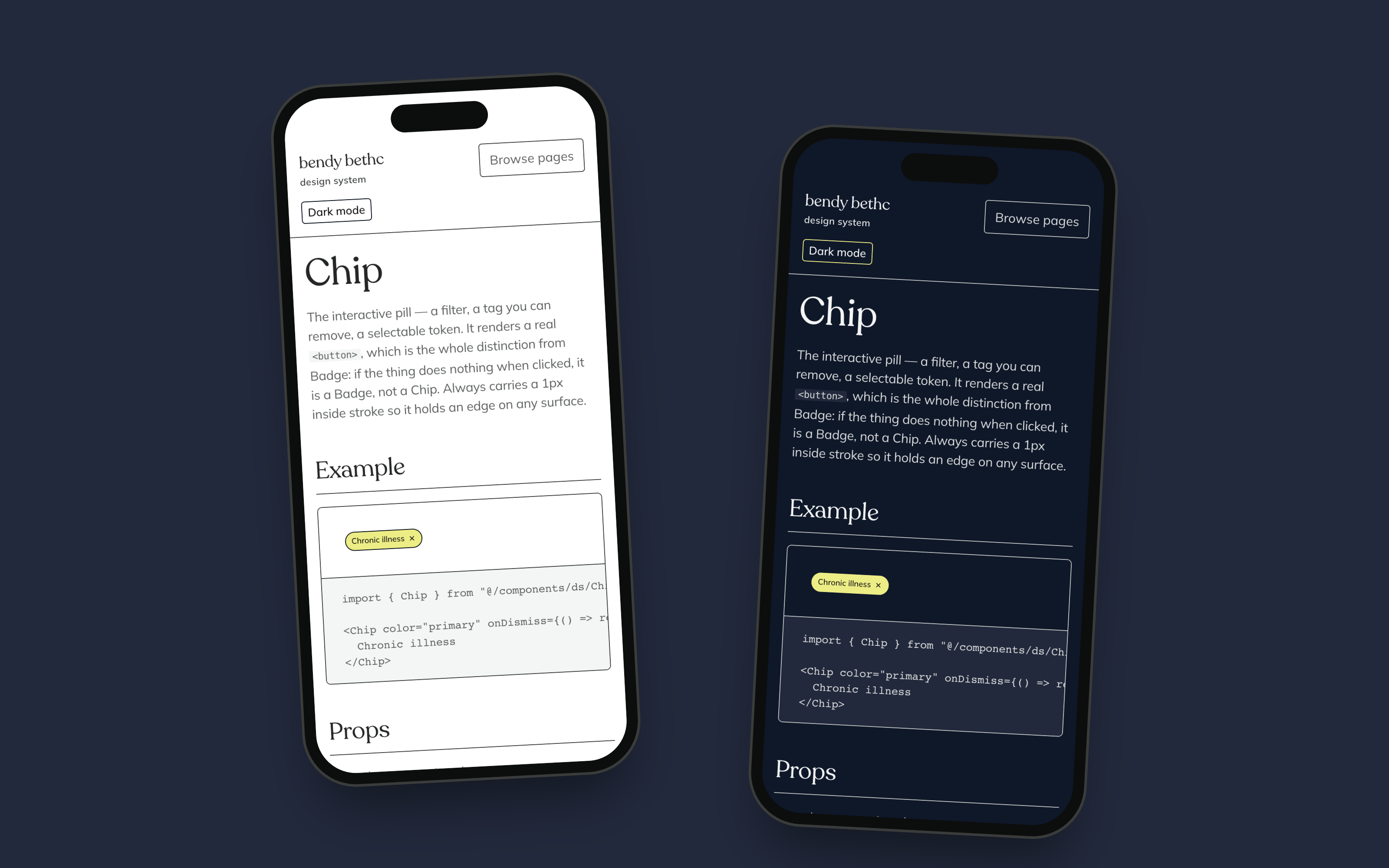
These are real screenshots of the running /ds showcase at 390px, not mockups. The showcase uses a stock sky photograph and sample copy, so there is no patient data anywhere in it.
Every component page in the showcase follows one fixed eight-section order, with the live example first and the code under it.
The walkthrough video, the laptop and the two phones show the same showcase in context, light and dark. Nothing in them is mocked up beyond the device frame.
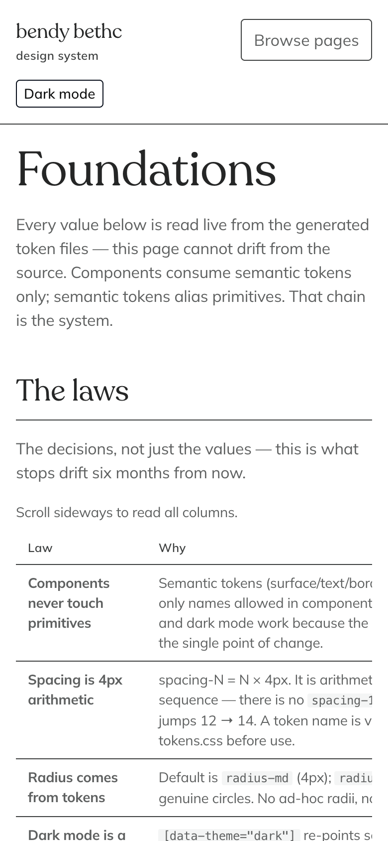
Every law has its reason beside it. The page says the decisions matter more than the values, because the values are read live from the token files and the reasons are not. On a phone the table scrolls sideways and the page says so.
Foundations, light, 390px
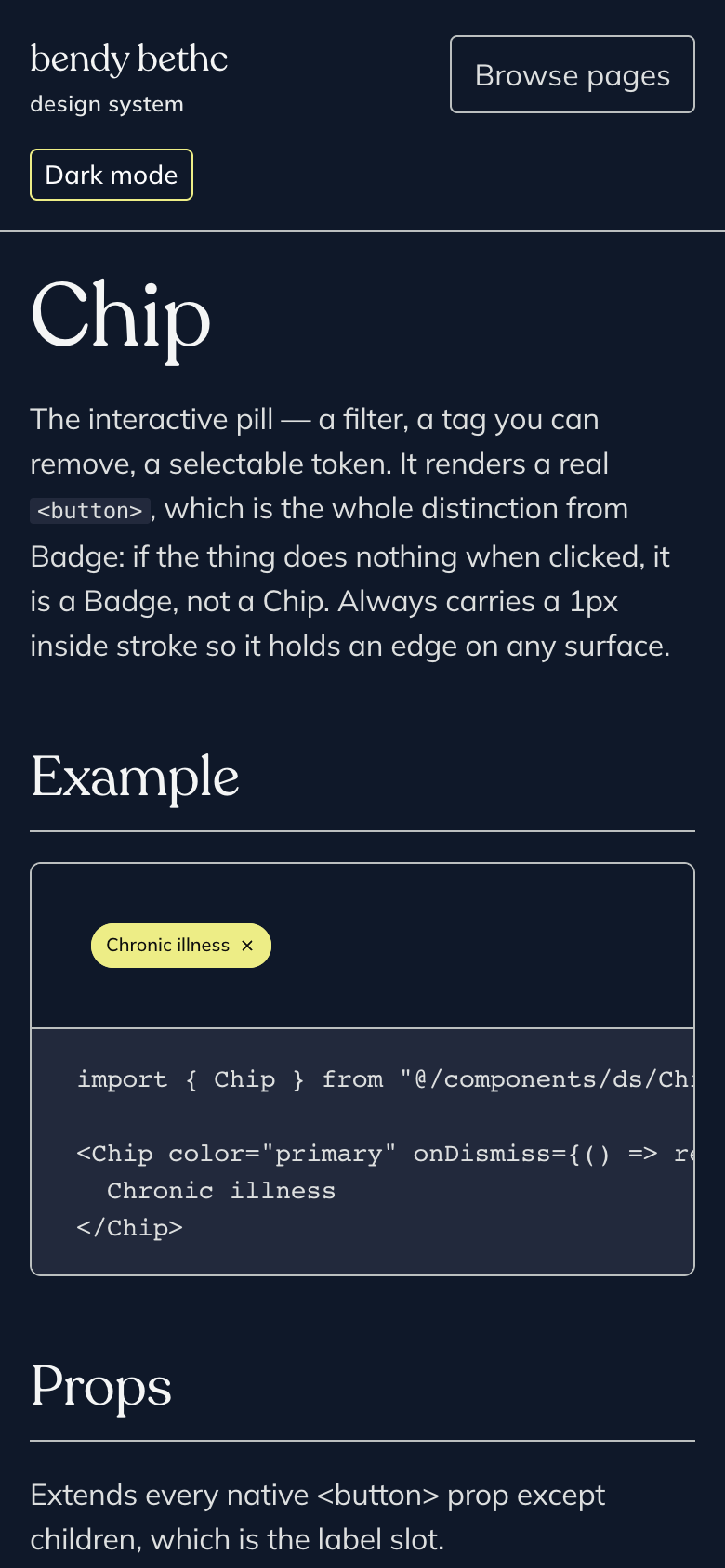
A chip is a real button. A badge is not. If the thing does nothing when clicked it is a badge, not a chip. The chip always carries a 1px inside stroke so it keeps an edge on any surface, including the navy ground.
Chip, dark, 390px
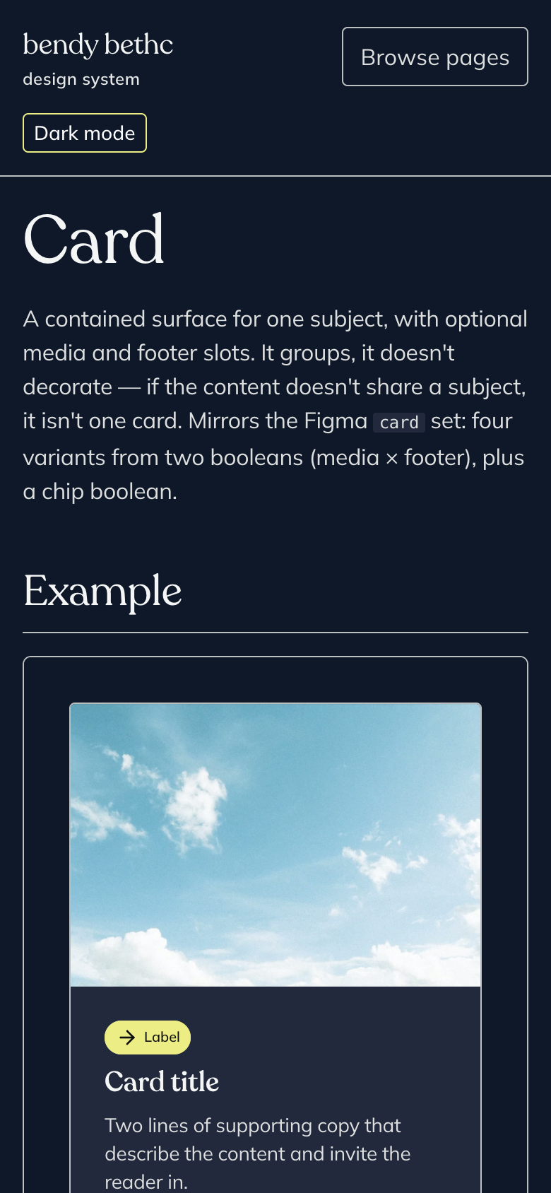
Same markup as light mode, one attribute different. The card holds its surface in dark because the semantic token changed, not because the component has dark CSS. The sky is a stock photo and the copy is sample text.
Card, dark, 390px
Reflect
Results
Drift is now loud. The showcase is still 58.5% complete and the site is only half on the system.
What is true today. Figma and the repo agree: 232 primitives, 175 semantic tokens per mode, and the responsive set at 105 variables across mobile, tablet, desktop and print, and the contrast audit has 0 hard failures. The token counts in the docs were re-measured on 15 Sep rather than carried forward.
What is not. On 14 Oct, 10 of the 34 components had zero uses on the site, and the site carried 7,259 lines of page-local CSS against 3,338 lines of component CSS. ds:done was 8 of 10 when I audited it, and I have not re-run it for this page.
Since that audit I routed the 7 orphan doc pages, added a real not-found page inside the showcase, corrected the registry from 33 to 34 atoms, and added the completeness check with a floor that ratchets up.
The showcase's own Overview page still says "Fourteen atoms and one pattern", and the registry has 34. I have not fixed it yet, and it is the exact kind of stale number the audit told me to generate from code.
Reflect
Learnings
Counts and names matching prove nothing, and a rule only holds when a script can fail on it.
On 4 Sep all 165 semantic token names matched Figma while 28 of 76 groups held the wrong values. Light mode was wearing dark mode's colours in 41 places and every check said in sync. Now I compare a hash of each group, not a list of names, and a hash that does not change after a real edit means the sync did nothing.
On 14 Oct the audit found the gate that said "30 components documented" could not see 7 pages nobody could reach. A check that cannot see the gap lets documented mean nothing, so the fix was another check, not a note.
The rules I only wrote down got broken, and the ones a script can fail on held. "Never hard inline code" was my instruction on 5 Oct, and the build now refuses it. That is the same law I use everywhere else: a recurring failure becomes a gate, not another document.
What I would change: generate every count in the docs from the code, show light and dark together on each page, and fix the disabled states before calling the contrast audit clean.
Reflect
Next
Close the gaps my own audit named, in the order it ranked them.
From the 14 Oct audit's top ten: finish the page-level patterns (a shared PageHero landed on 15 Oct), a token reference page with search and copy-name, anatomy and states on the four layout primitives, and a link to /ds from the site.
Then a version, a changelog, a Figma link on every component page, and a real title for every /ds route.
I have not scheduled any of this. It is the audit's list, not a promise with dates.
The one thing I want before any of it: someone who uses a screen reader going through the showcase, and telling me what I got wrong.