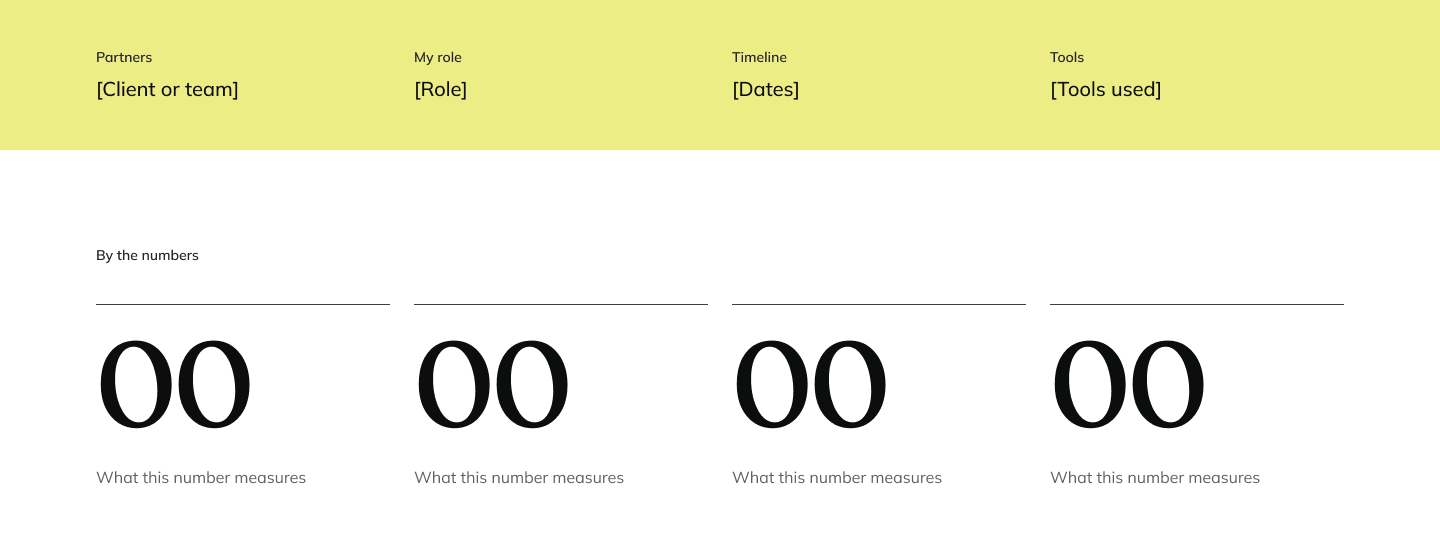
By the numbers
- 61text slots in the approved Figma template
- 10of them filled by fill.py today, and no images
- 4research notes, about 4,400 words, written before I chose the look
- 1 hrfrom my first ask for a template (21:23) to my approval being logged (22:30)
All four are counted from files: fill.py, the template, docs/research, and my braindump timestamps for 15 October. None of them is an outcome.
Discover
Overview
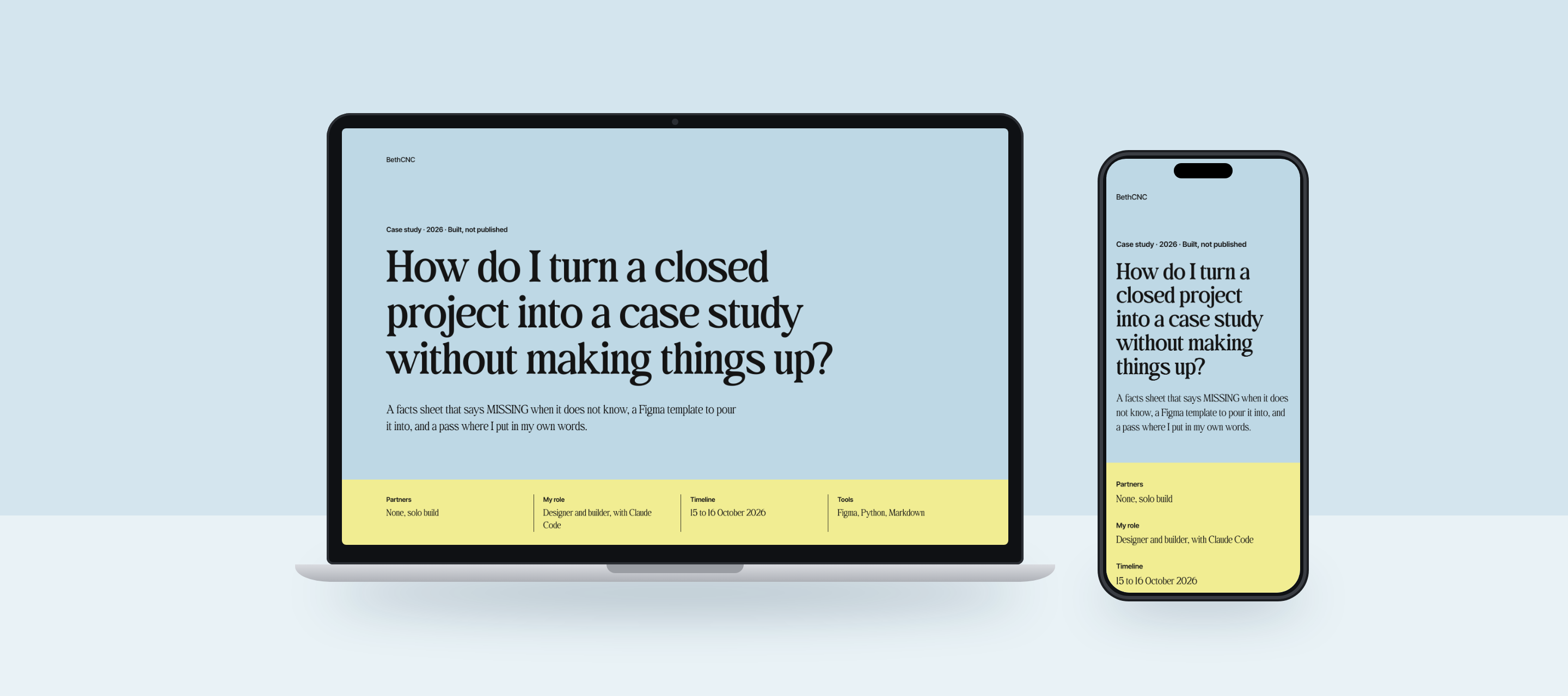
I have more finished work than three case studies, and I do not want twelve basic ones. So I built how they get made: one template, one facts sheet per project, and a rule that anything the repo cannot prove stays MISSING until I write it.
The template is Figma node 7:2. The facts sheet comes from facts.py. Between them sits a look step, where the render gets opened before anything is called built, and my pass, where I fill the holes in my own words.
Define
Problem
My portfolio plan allowed three case studies. On 15 October I said that was not enough, and the list grew to twelve projects. Writing each by hand means twelve layouts and twelve chances to make up a number.
The first run showed the other problem. I pointed facts.py at a system that lives inside the second-brain repo, and it described the whole repo instead: 2,410 commits and the README's problem text. I replaced those lines by hand.
Define
Persona
I hate basic and boring design and need my case studies to be visually appealing and perfect and studio quality and worthy of being on Dribbble and Behance for case studies.
Two readers. I am one, with eleven of these in progress. The other is a recruiter or hiring manager who gives a study about a minute, which is what the structure research found. So every page needs a skim layer that tells the story alone.
Discover
Research
Four research notes, all dated 15 October. Structure: eight guidance articles and four real case studies. New product: what changes when the designer also built it and it has not launched. Page patterns: four developer-designer case-study pages, with their HTML and CSS read. Visual examples: eight real pages.
None of them looked at pixels, because the fetch tool returns text only, and several sites (Behance among them) returned 403 and were not worked around. The look came from the two portfolios I picked. The section order came from two example case studies, HabitFy and Seha+, and the notes gave me the status label for unlaunched work and the rule that numbers stay honest when there are no launch metrics.
Design
Key decisions
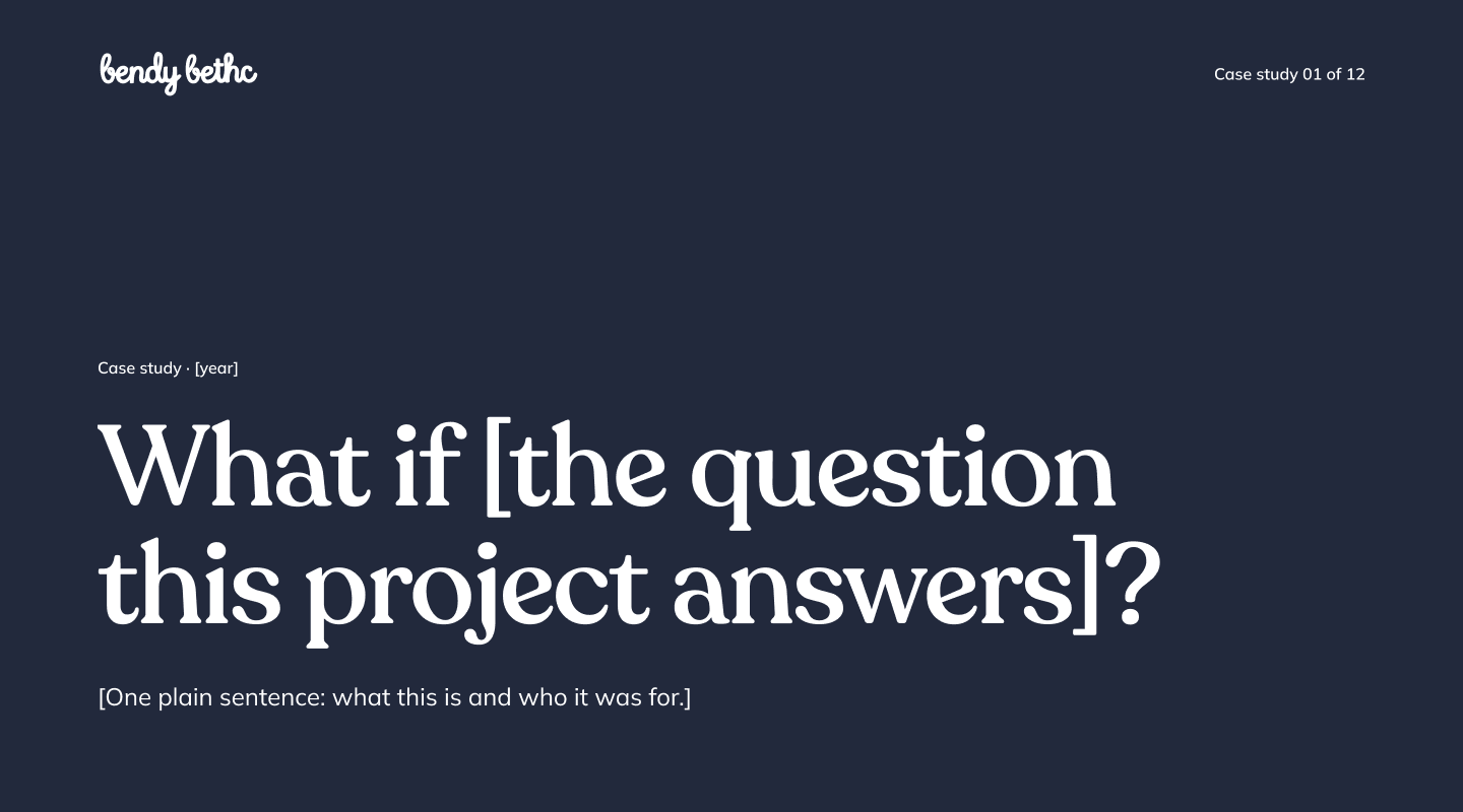
Havana's layout, Aarron's metadata row and numbers strip
OptionsA purple, sparkle, tinted-card template (HabitFy), Behance-style image stacks, or two plain portfolios.
Choice and costI picked the two plain ones on 15 October at 22:17. It costs me the animated counters and a decorative hero, so the writing has to carry each page.
Remove the brand shape
OptionsDirection A had a navy hero with a big yellow hand-drawn blob. Keep it, swap it, or delete it.
Choice and costDeleted, no replacement, after my note at 22:24. The page loses the one hand-drawn mark and leans on type, the real logo and a hairline. The first session never saw my note because it hit a token limit, so a fresh session had to be started for the redo.
Colour names the phase
OptionsOne accent on the whole page, or a colour per distinction, the way my handouts do it.
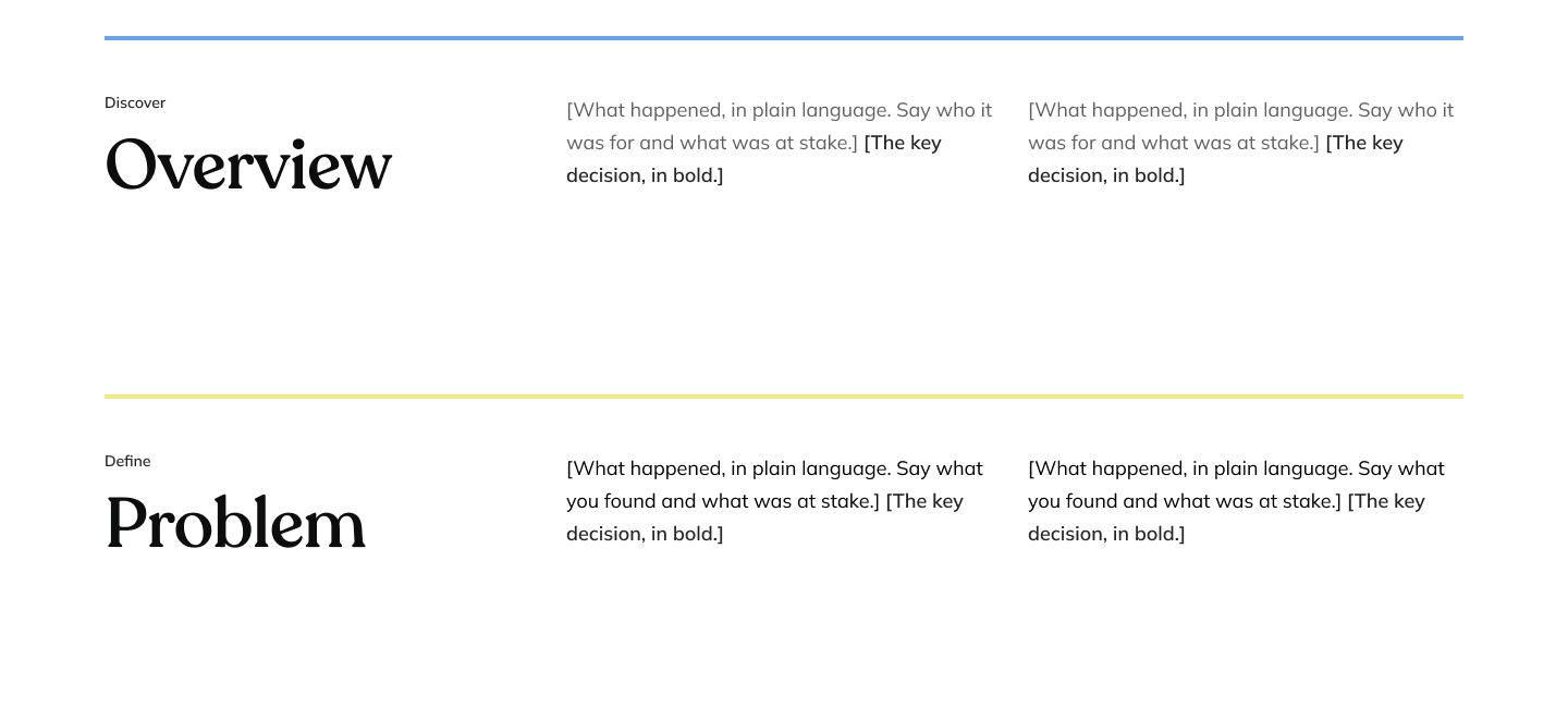
Choice and costA 4px rule per section: blue Discover, yellow Define, pink Design, navy Reflect. It puts four colours on a page, so the phase name is also written above each heading. This BethCNC page swaps the template's pink for the skin's orange.
Unknown stays MISSING
OptionsLet the script write plausible text, or leave the template placeholder in place.
Choice and costThe placeholder stays. Every page comes back with holes only I can fill: title, partners, problem, persona, learnings.
Design
Before and after
Direction A was my first look. Its blob was deleted in Figma and no export with it exists, so the before image shows the layout without the shape.
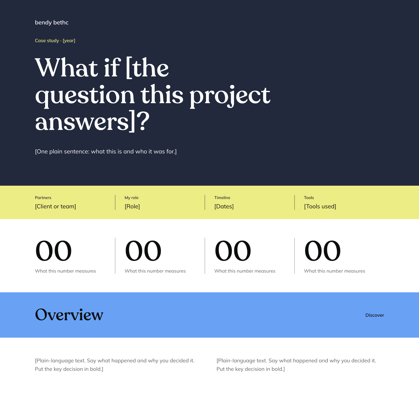
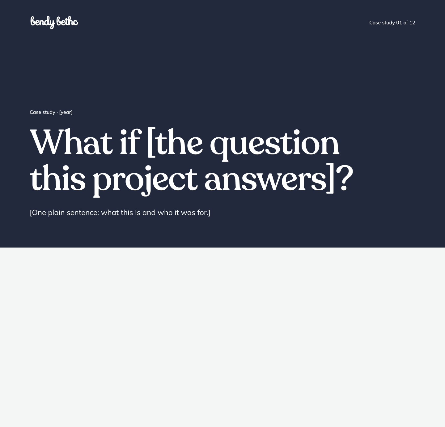
| Part | Direction A | Approved 7:2 |
|---|---|---|
| Brand shape | Yellow hand-drawn blob | None, no replacement |
| Logo | Text wordmark | Real white horizontal logo |
| Section header | Solid blue bar | 4px rule, colour by phase |
| Grid | Not stated | 1440 wide, 96 margins, 12 columns |
Design
Flow
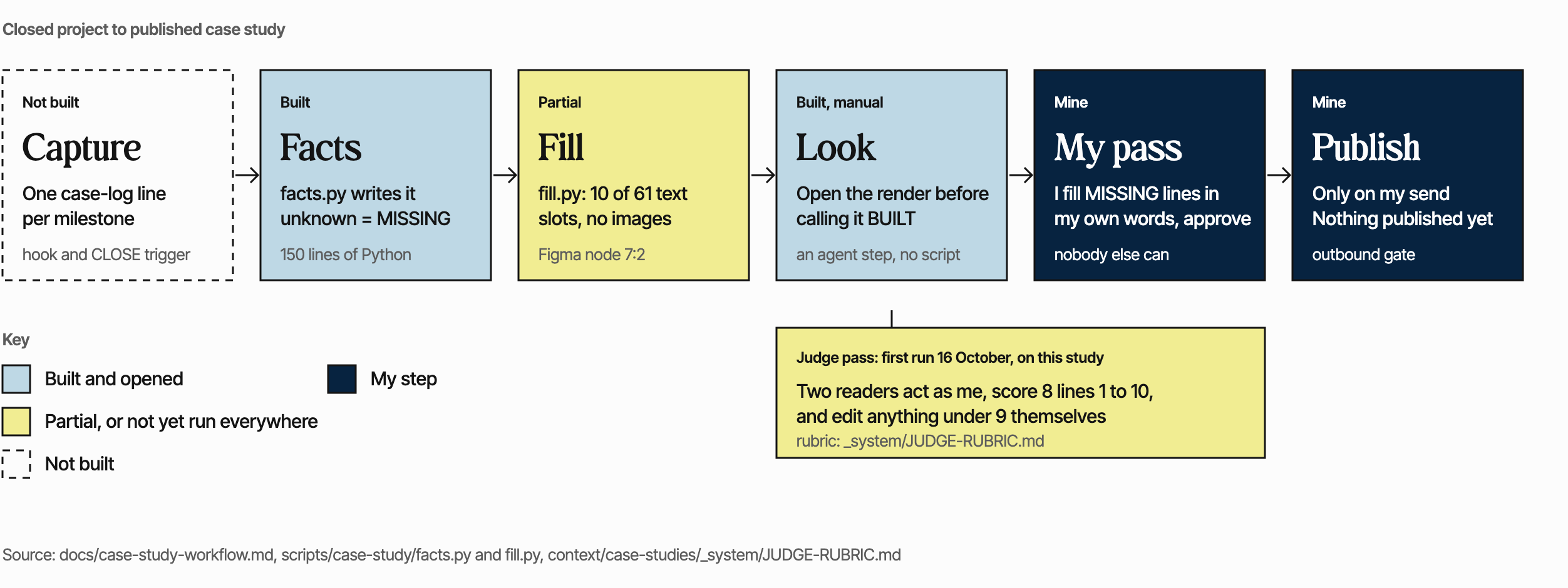
Capture, facts sheet, fill, look, my pass, publish. The diagram shows what is built and what is not, because a flow that hides its gaps is the thing this project exists to avoid.
Two steps do not exist yet: the case-log hook that adds one line per milestone, and the CLOSE trigger that starts the whole thing. Fill is partial, and the judge pass, two readers acting as me, first ran on 16 October.
Text version of the video
Six callouts over the template: the question as title, the metadata row and numbers strip, a section with its label and two columns, the flow slot, three screen slots, and the navy rule that closes the page. Then Direction A beside the approved template with my 22:24 note. Then the six flow steps appear one at a time, each marked built, partial, not built or mine, with the judge pass last.
Design
Hi-fi screens
The real exports of node 7:2, with the template's own placeholder text.
Design
Accessibility
The Figma template itself has not been audited, and nobody has tested this page with a screen reader. I will not claim more than that.
What I measured: ink on the blue is 12.4 to 1, ink on the yellow 15.1, white on the navy 15.5, body grey on white 10.6, all above WCAG 2.2 AA's 4.5. Colour is never the only signal, since each section's phase is written above its heading.
On this page, axe-core 4.13 found no WCAG 2.2 A or AA violations at 1440 and 390 wide. A keyboard pass reaches the skip link, the flow diagram, the video, its text version and Back to top, each with a visible focus ring. The video has no sound, so its text version stands in for captions. Nothing autoplays, and reduced motion is respected.
Reflect
Results
The template is approved. My words on 15 October: "I approve the full template." It is the reference for every study.
When I built this page, eleven case studies, this one included, were being built from it overnight, with two judge passes queued for each. None is published, and I have not measured hours saved, so I am not claiming any.
Reflect
Learnings
A script that never guesses still needs a scope. facts.py described the repo it stood in, not the system I meant. It needs a path filter.
Write down what is not built. The first fill was built for text only. The image slots stayed grey boxes, because the Figma tool cannot read local files, and the status file said so.
Say it to the session that can act. My shape note went to a session that had hit its token limit and could not read it.
Reflect
Next
- Build the case-log hook and the CLOSE trigger.
- Give facts.py a path filter, and fill.py image slots.
- Link the design-system libraries, which I parked on purpose.
- Make the BethCNC version of the template, also parked.